Forum: The Situation Room > Table styles
Now that the sidebars are all converted, I thought it might make sense to effect a similar change for the various tables (fancy, simple, etc.) we currently use. I'm thinking of something in the vein of the following examples:
| Picture | Totals | Episode | Name | Method |
|---|---|---|---|---|
 |
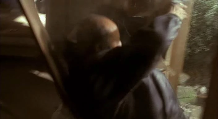
1 / 1 | "1:00am-2:00am" | Ira Gaines hitman #1 | SIG P228 with silencer |
| Jack killed this assailant while escaping with Richard Walsh. 1:35am | ||||
 |
2 / 2 | "1:00am-2:00am" | Ira Gaines hitman #2 | SIG P228 with silencer |
| Killed this assailant while escaping with Richard Walsh; also cut off his thumb for identification. 1:35am | ||||
 |
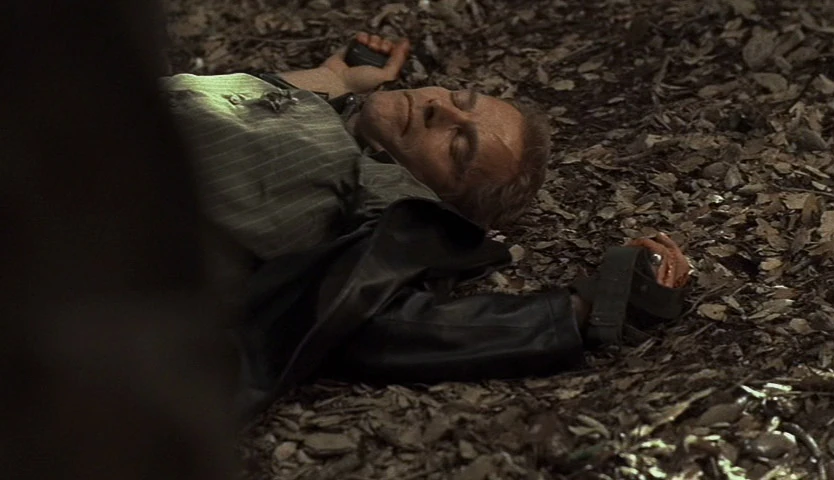
3 / 3 | "10:00am-11:00am" | Ted Cofell | Punch to the heart |
| Jack punched Cofell in the heart while interrogating him. Cofell had a heart problem, and refused to take his medicine after Jack hit him. Jack tried force-feeding him his pills, but Cofell resisted and died. 10:36am | ||||
 |
4 / 4 | "11:00am-12:00pm" | Ira Gaines terrorist #1 | Van explosion |
| As Jack escaped from Gaines' compound, he blew up a van, which killed two nearby terrorists. 11:59am | ||||
|
5 / 5 | "11:00am-12:00pm" | Ira Gaines terrorist #2 | Van explosion |
| As Jack escaped from Gaines' compound, he blew up a van, which killed two nearby terrorists. 11:59am | ||||
 |
6 / 6 | "12:00pm-1:00pm" | Neil Nagi | SIG P228 with silencer |
| Neil was searching for Kim and Teri, but Jack killed him before he could reach them. 12:23pm | ||||
 |
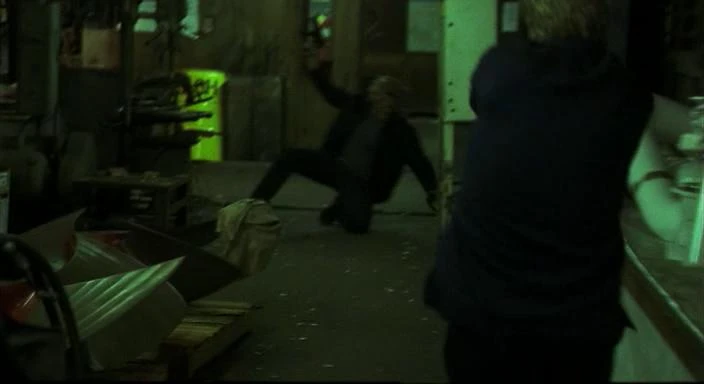
7 / 7 | "12:00pm-1:00pm" | Ira Gaines | SIG P228 with silencer |
| Even though he knew he would be killed, Gaines turned around to shoot at Jack, because he preferred death now to what his employers would do. 12:56pm | ||||
 |
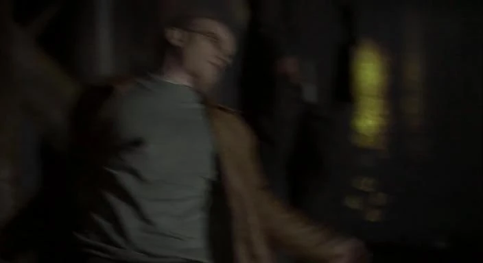
8 / 8 | "11:00pm-12:00am" | Marko | HK USP x 2 |
| Jack went on a killing spree after he believed Kim to be dead. 11:21pm | ||||
 |
9 / 9 | "11:00pm-12:00am" | Andre Drazen | HK USP x 2 |
| Andre was killed when Jack had his final shootout with the Drazens on the pier. Jack believed that the Drazens had killed Kim earlier in the evening. 11:22pm | ||||
 |
10 / 10 | "11:00pm-12:00am" | Victor Drazen | HK USP |
| Victor tried to shoot Jack, but ran out of bullets. He surrendered, but Jack hit him with a total of twelve shots until he emptied his gun. 11:23pm | ||||
| Picture | Title | Number | Code | Written by | Directed by | Original airdate |
|---|---|---|---|---|---|---|
 |
"4:00pm-5:00pm" | 171 | 8AFF01 | Howard Gordon & Evan Katz | Brad Turner | January 17, 2010 |
| At the United Nations in New York City, US President Allison Taylor and Kamistan President Omar Hassan are putting the finishing touches on an historic peace treaty. With a new lease on life, Jack Bauer plans on moving back to Los Angeles with his daughter Kim and granddaughter Teri, but his plans are put on hold when an old informant comes to him with information on an assassination plot against Hassan. | ||||||
 |
"5:00pm-6:00pm" | 172 | 8AFF02 | Howard Gordon and Manny Coto & Brannon Braga | Brad Turner | January 17, 2010 |
| CTU New York arrests a journalist for breaking into the UN database, but Chloe O'Brian suspects a frame job and asks for Jack's help to find the real culprit. Meanwhile, a secret from Dana's past comes back to haunt her. | ||||||
 |
"6:00pm-7:00pm" | 173 | 8AFF03 | David Fury & Alex Gansa | Milan Cheylov | January 18, 2010 |
| Hot on the assassin's trail, Jack finds himself set up as a cop killer and endures torture by a corrupt NYPD officer. President Omar Hassan argues with his brother about telling CTU about his affair with Meredith Reed, even though it will help prove her innocence. Presidents Taylor, Hassan, and the rest of the United Nations building are evacuated due to a bomb threat. | ||||||
 |
"7:00pm-8:00pm" | 174 | 8AFF04 | Chip Johannessen & Patrick Harbinson | Milan Cheylov | January 18, 2010 |
| President Hassan takes temporary residence in the CTU New York building in the aftermath of the motorcade bombing. Uranium-235 particles are discovered on the dead body of Davros, indicating that his organization has possession of weapons-grade nuclear material. A damaged Renee Walker returns and is given an undercover assignment in the Russian mob, but not everyone thinks she's ready. | ||||||
I used the navbox classes as a placeholder, since they're pretty close to what it'll look like. While we're on the subject, I've also been thinking about whether to change the blue theme to something else, maybe something with gold to reflect the clock. No specifics at this point, but feel free to contribute or mess with the examples. --Pyramidhead 07:02, July 14, 2010 (UTC)
I really like it. Looks good Pyramidhead :) --Station7 07:08, July 14, 2010 (UTC)
- Thank you. Bump. --Pyramidhead 05:55, July 23, 2010 (UTC)
- Thanks man I think the centered text is excellent. With the new table is it possible to have the images the same size as they are in the current form of the table? I'm looking at the new variant from a handheld device's browser and the images are just little smears. Blue Rook talk contribs 18:32, July 26, 2010 (UTC)
- The images can be any size, I just thought it might make sense to have the kills ones smaller, since the descriptions are so short. I've emailed you a new version of Monaco.css with the changes made. I got rid of the simple class, and added some classes so that alignment can be changed easier; the changes by themselves are here. I'd wait until late tonight if you're going to switch over, though; I'll need to go through and adjust some things once it's done. --Movebot 20:31, July 26, 2010 (UTC)
- Thanks man I think the centered text is excellent. With the new table is it possible to have the images the same size as they are in the current form of the table? I'm looking at the new variant from a handheld device's browser and the images are just little smears. Blue Rook talk contribs 18:32, July 26, 2010 (UTC)